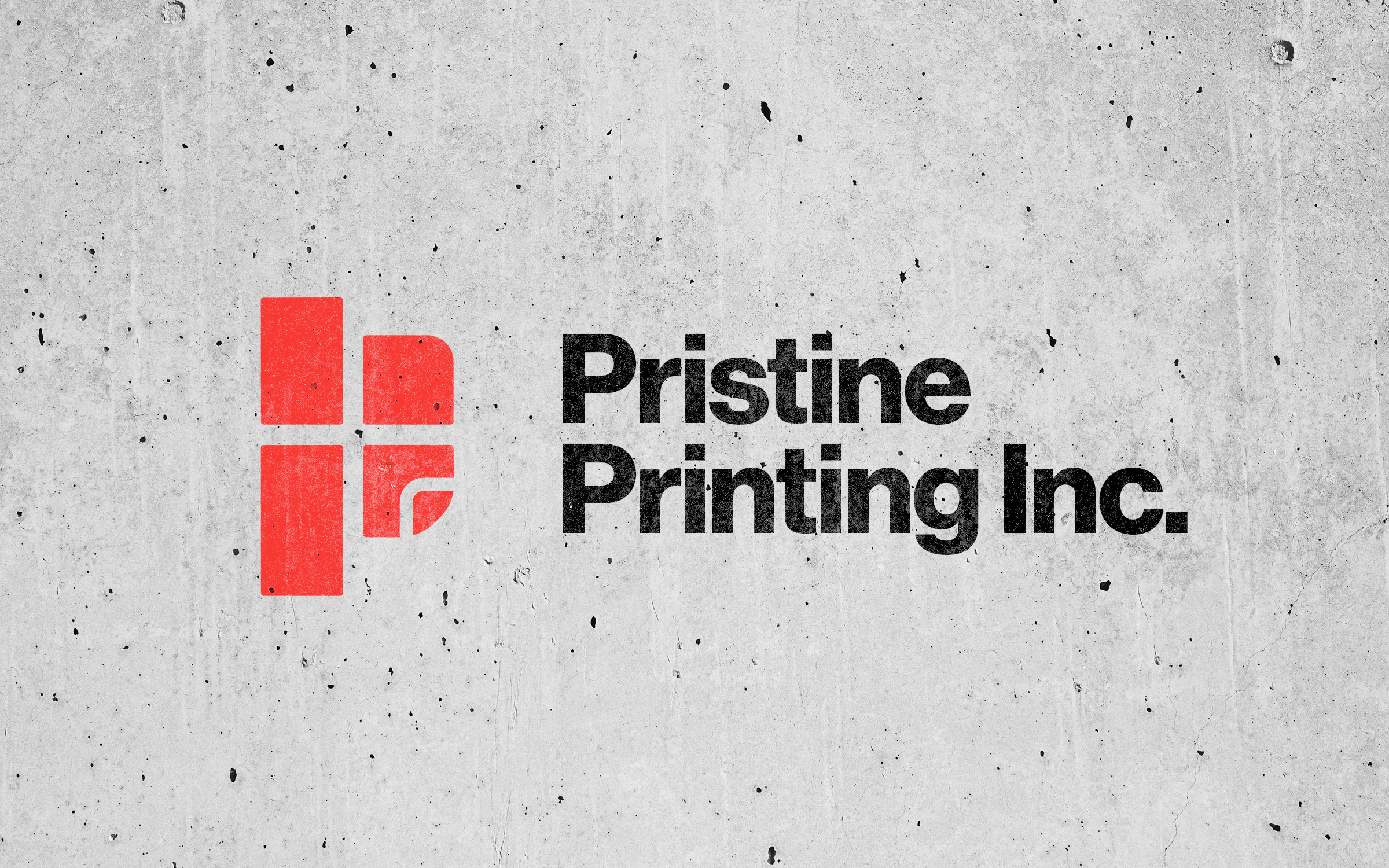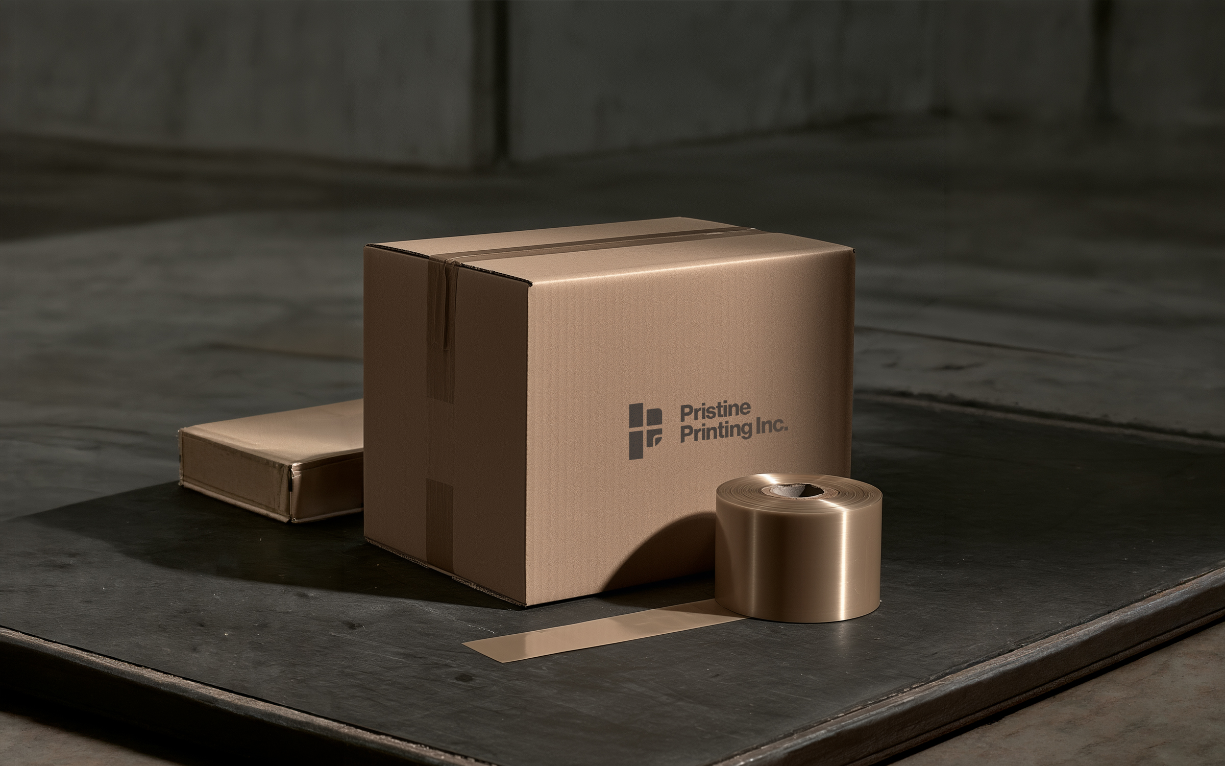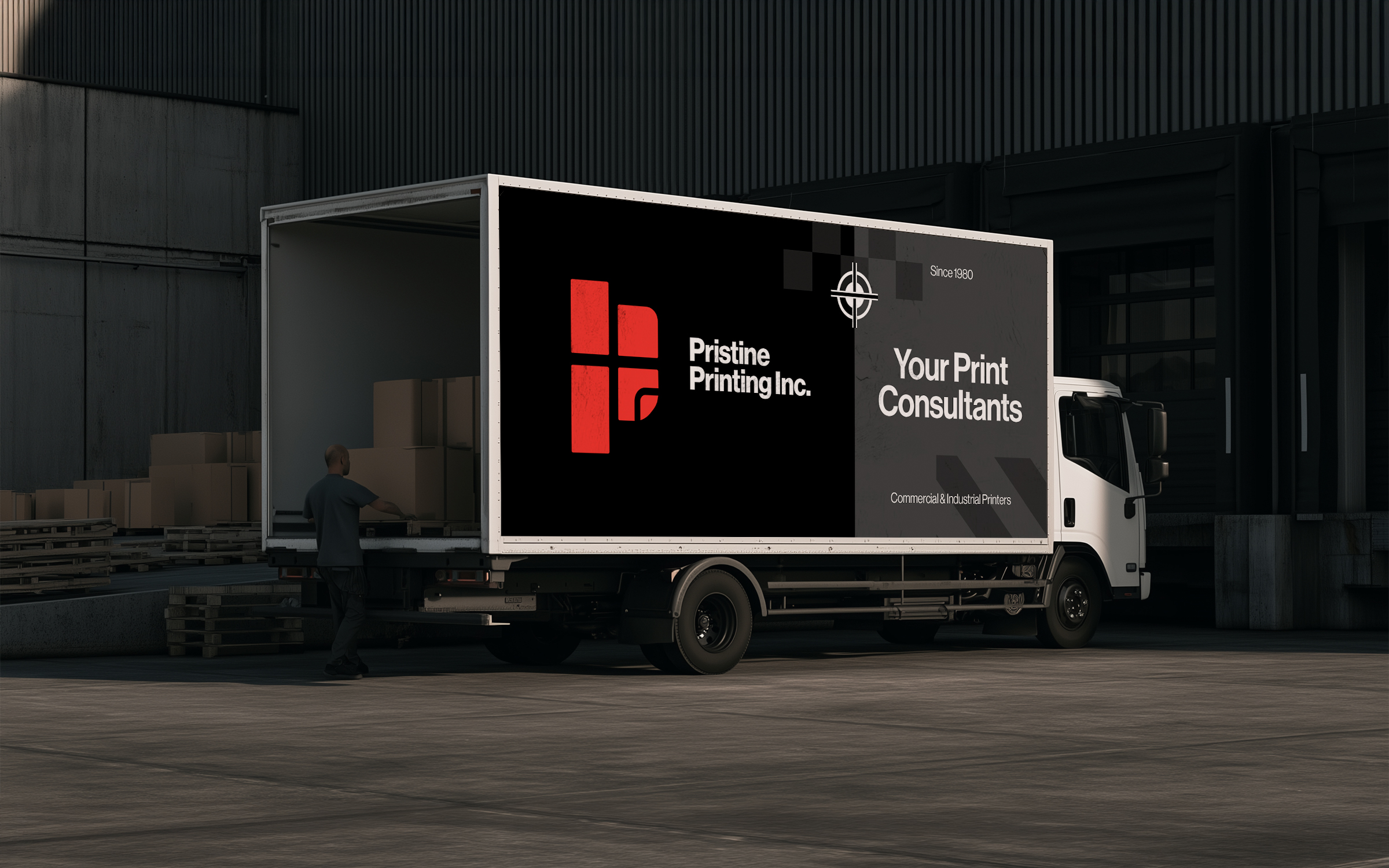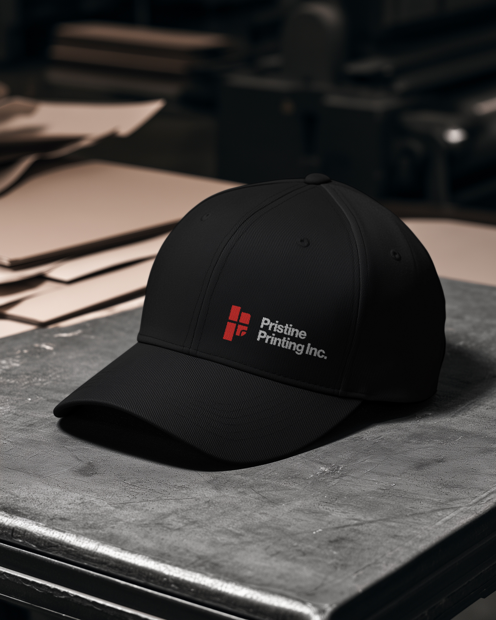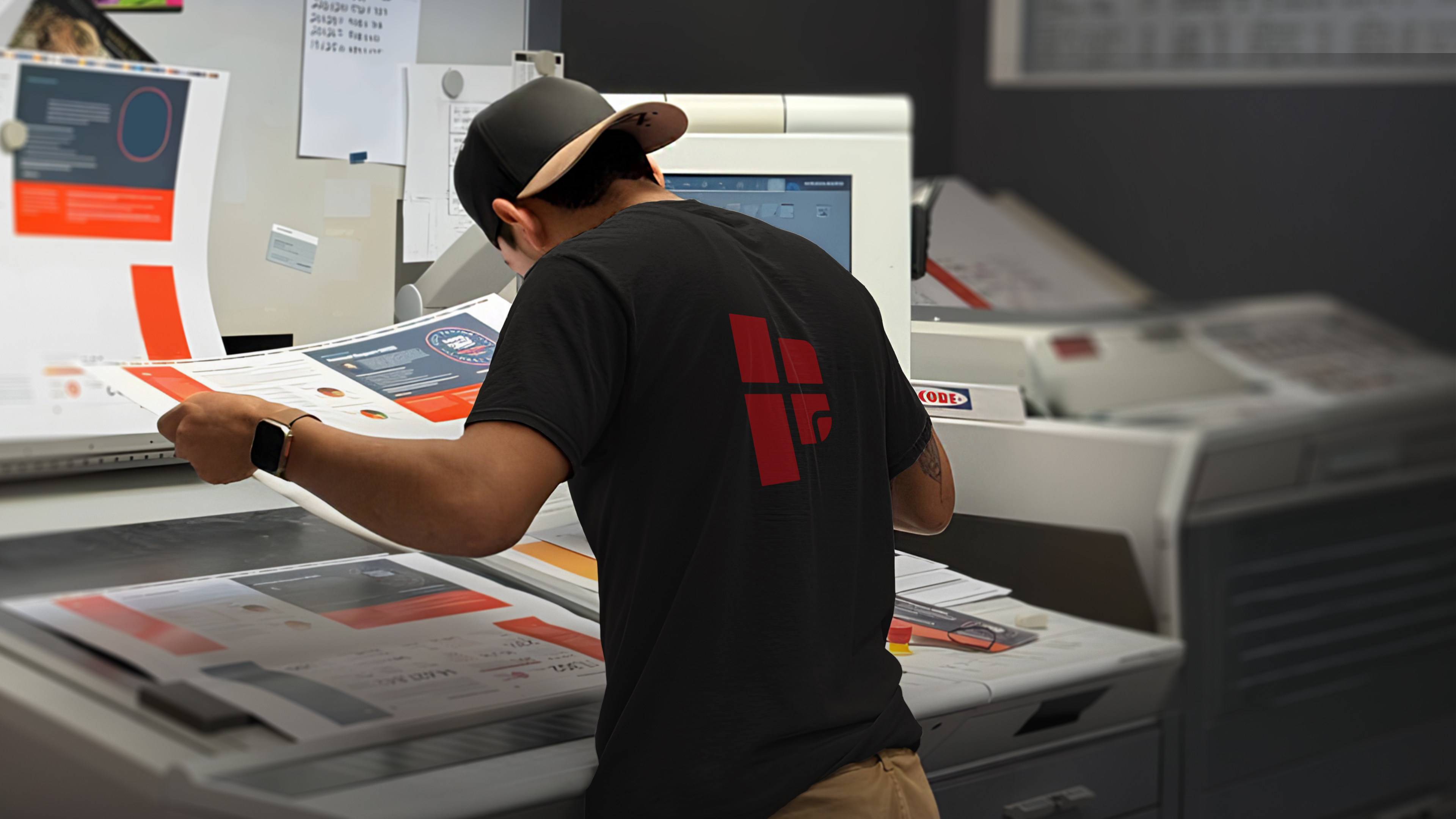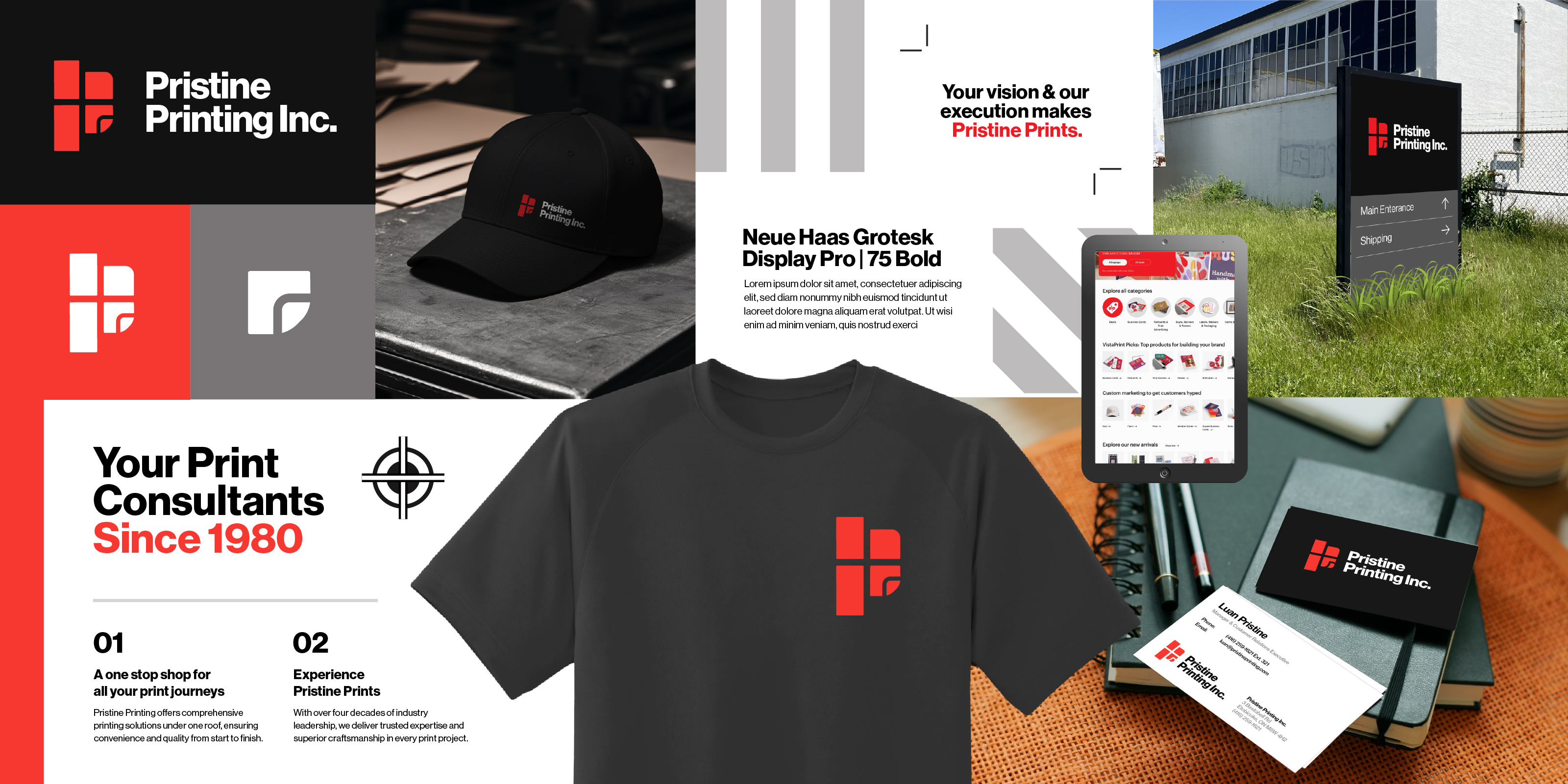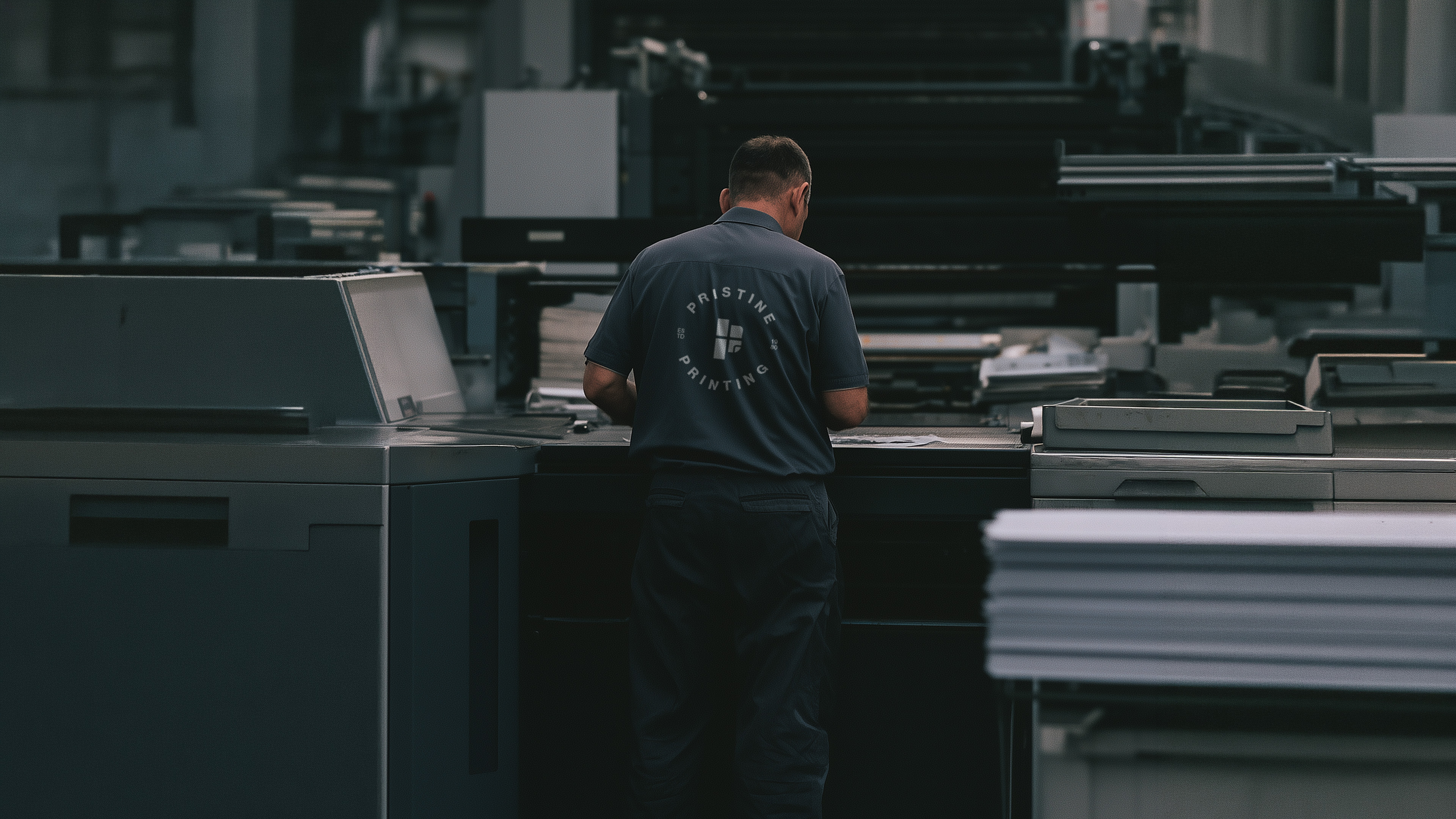
Pristine Printing is an established commercial print company serving businesses and corporate clients with professional print solutions for over four decades. The project focused on evolving its identity to better reflect the scale, expertise and reliability behind the business while positioning it for a contemporary market.
Pristine Printing Inc.
2024
Brand Strategy & Visual Identity
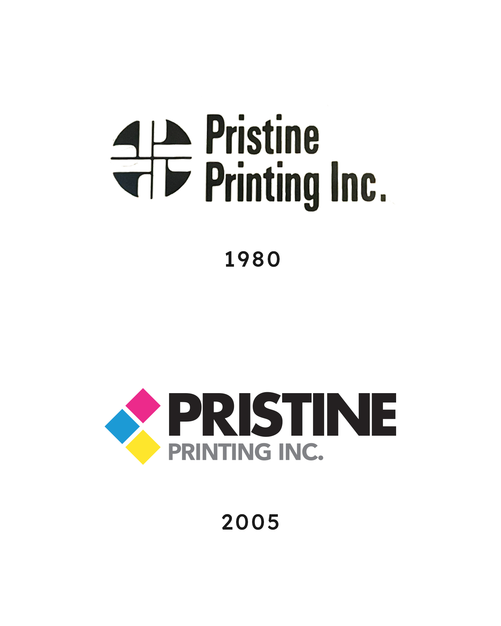
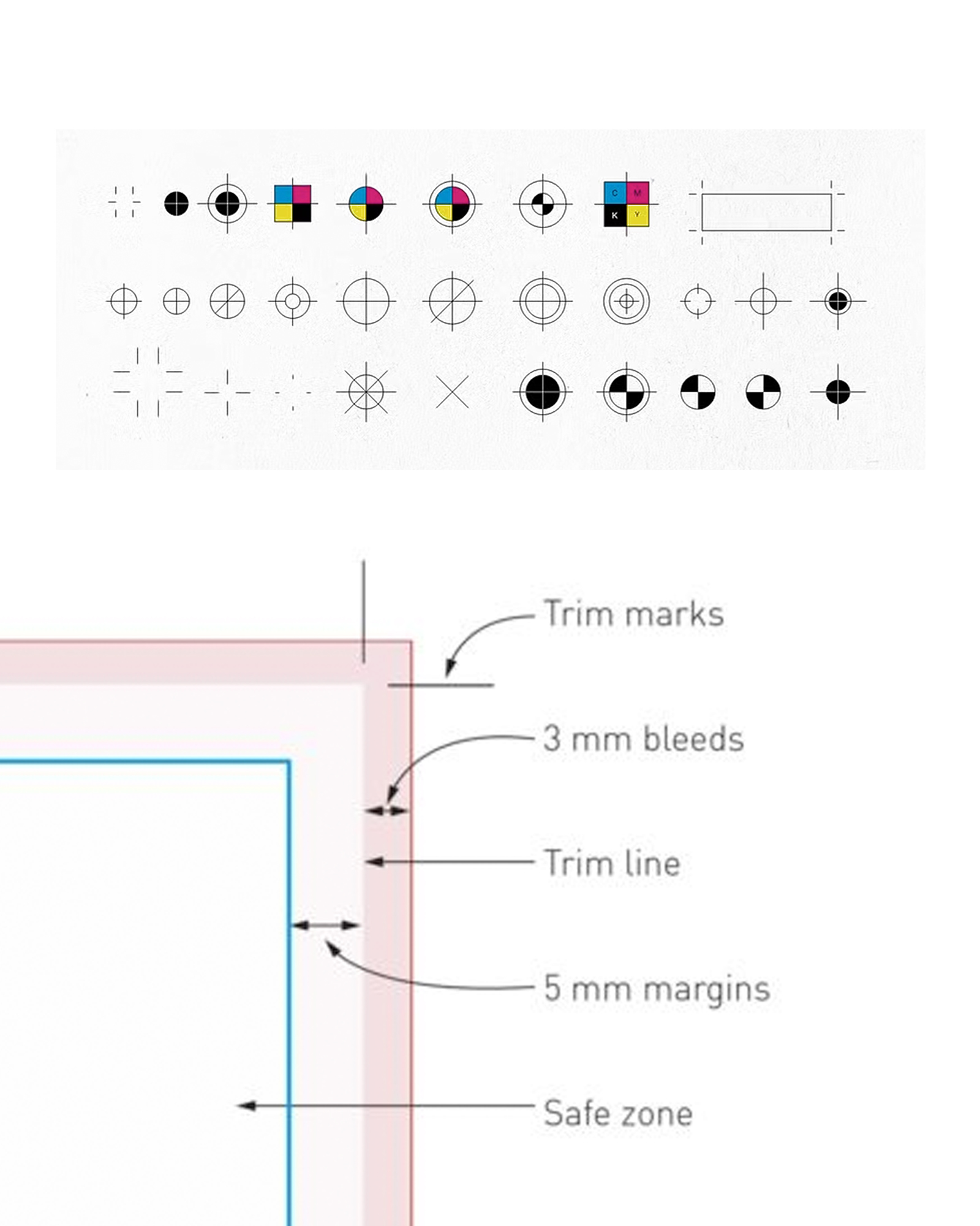
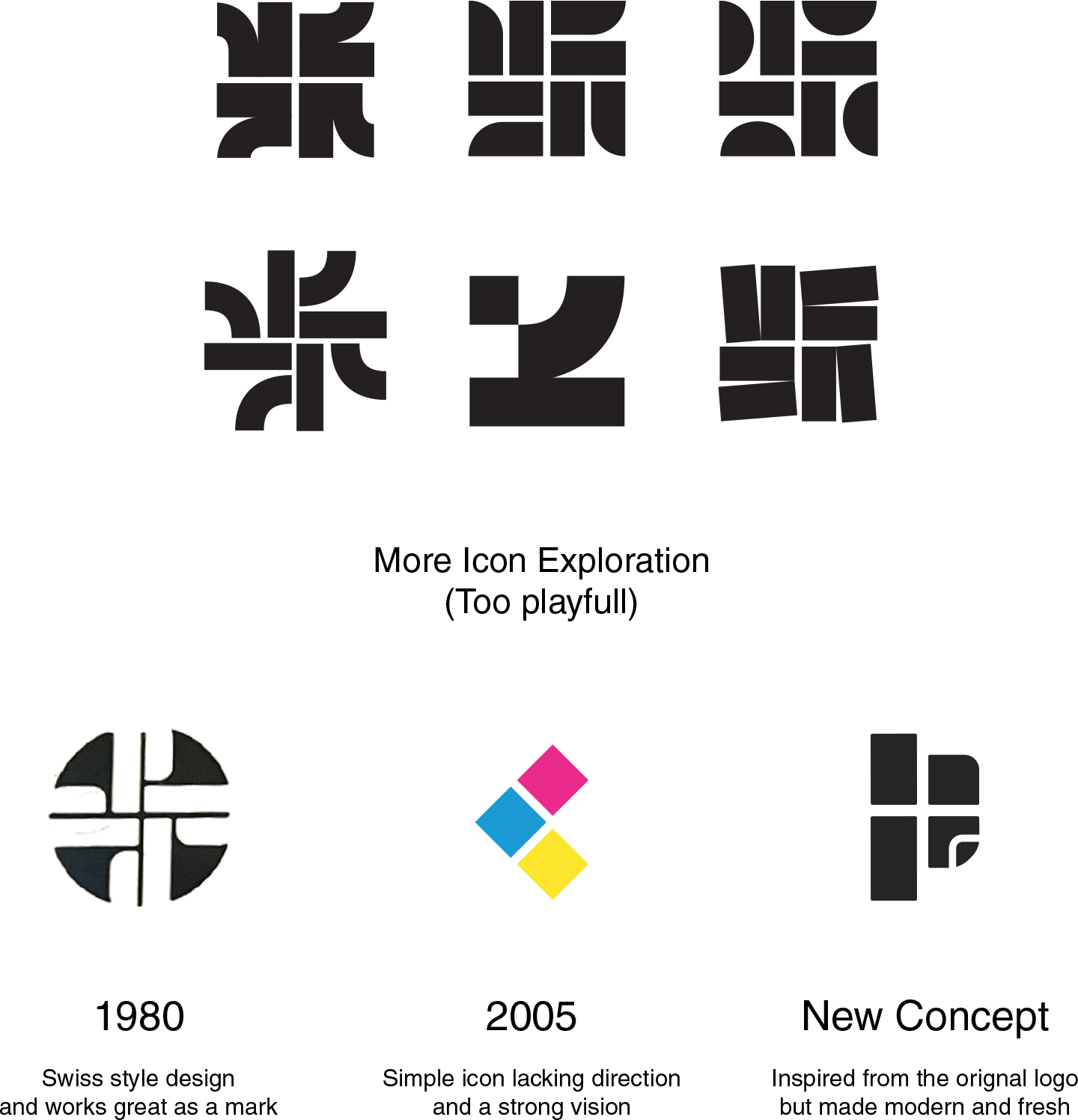
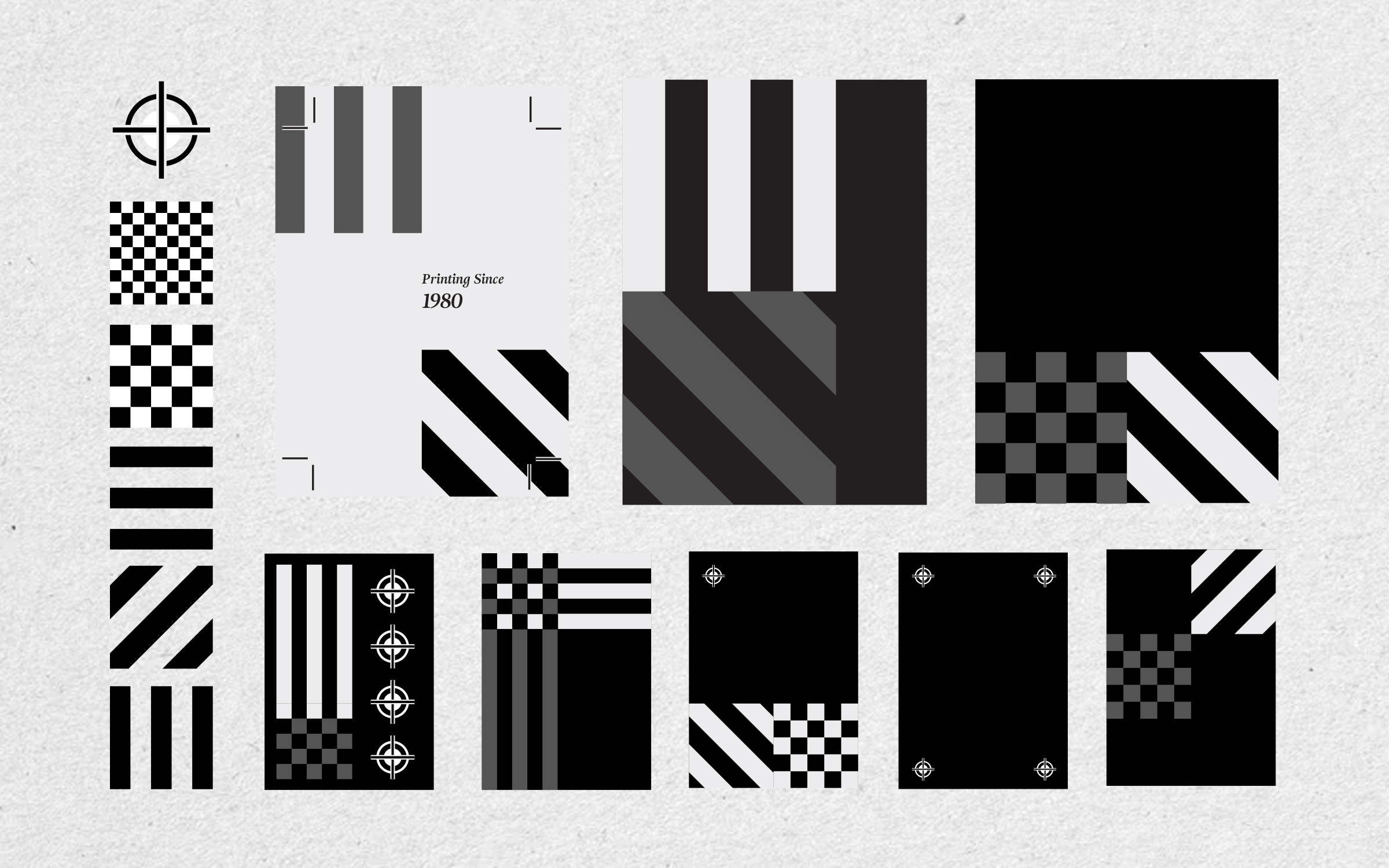
The new visual identity is bold, minimal and direct, drawing inspiration from the precision and physical processes of commercial printing as in the orignal logo.
A modular logo system, confident typography and a focused red, black and neutral palette create a recognizable visual language that works consistently across different scales and applications.